Role
With our team of four and six-week design timeline, each member took on a design lead role for each step of the process. I was the design lead for the mid-fidelity prototype and user research phase and collaborated equally on the additional phases.
Overview
Japa is a startup located in northern California that provides real-time smart parking information.
Their current mobile app has quite a few issues that diminish the credibility of their great product so our team's goal was to conduct a full redesign to heighten the user experience.
About
User research, Interaction, Visual design, Prototyping & testing
Team: Miranda, Edward, and Briana
April 2020 - May 2020
The Problem
"Japa's pioneering technology makes the parking experience for consumers easier, while making campuses and cities more efficient." It is based on company-installed parking occupancy sensors that are over 99% accurate and digital signage that helps parking garages accurately display available parking. The problem lies within their app. It is not intuitive and reduces the credibility of the powerful technology it accompanies.
Japa wanted to optimize the current app in a way that minimizes additional development resources needed and can be scaled easily for future features. Our team set out to conduct a full redesign to address these core design and usability issues.
CLIENT ANALYSIS
What is Japa?
JAPA is a free mobile guidance app that provides access to accurate real-time parking availability, parking lot information, and policies. The free app allows users to view spots ahead of time to plan out their parking experience before leaving the house.
JAPA installs parking sensors in parking lots that allow a parking lot manager to view different metrics about their lot, and that allow users to view real time parking availability through their app. Their motto is “Park Smart. Stress Less.”, which is something that has guided our design decisions through this whole process.
B2B to B2C
Currently, with launching their startup, Japa has been focusing heavily on marketing to businesses. This is even shown through the content on their website. With their hardware now installed into various garages, they want to revamp their mobile app to ensure their users have a good, efficient experience with Japa.

Current Mobile App
Now let's talk about the app itself. The main components (shown below) are the map, parking layout, and the information page. The map shows each parking location in relation to the area, the parking layout presents the user with the open parking spots in real-time, and the information page gives the user further detail such as directions. Once our team used the app, we encountered various problems. It was slow, directionless, and did not seem to follow modern UI design trends. Our goal was to flip these problems around and build screens that are efficient, intuitive, and clean.


USER RESEARCH
Park Smart and Stress Less
As a growing start-up, JAPA knew what audience they wanted to target but they had yet to get to know them personally. To understand and genuinely empathize with users, we utilized different strategies, including user task analysis, user interviews, and user surveys. These research methods revealed qualitative based insights using the three learning styles: kinesthetic, visual, and auditory to obtain a well-rounded perspective on our users' thought processes.
Business to Human Questions
Our team started by asking Business to Human questions. This allowed us to discover new opportunities that would better fit customer needs. Some main insights we gathered were based on the user's thinking process, usability & functionality, competitors & credibility, lifestyle & experiences, goals, needs, & motivations, and first impressions.

User Task Analysis
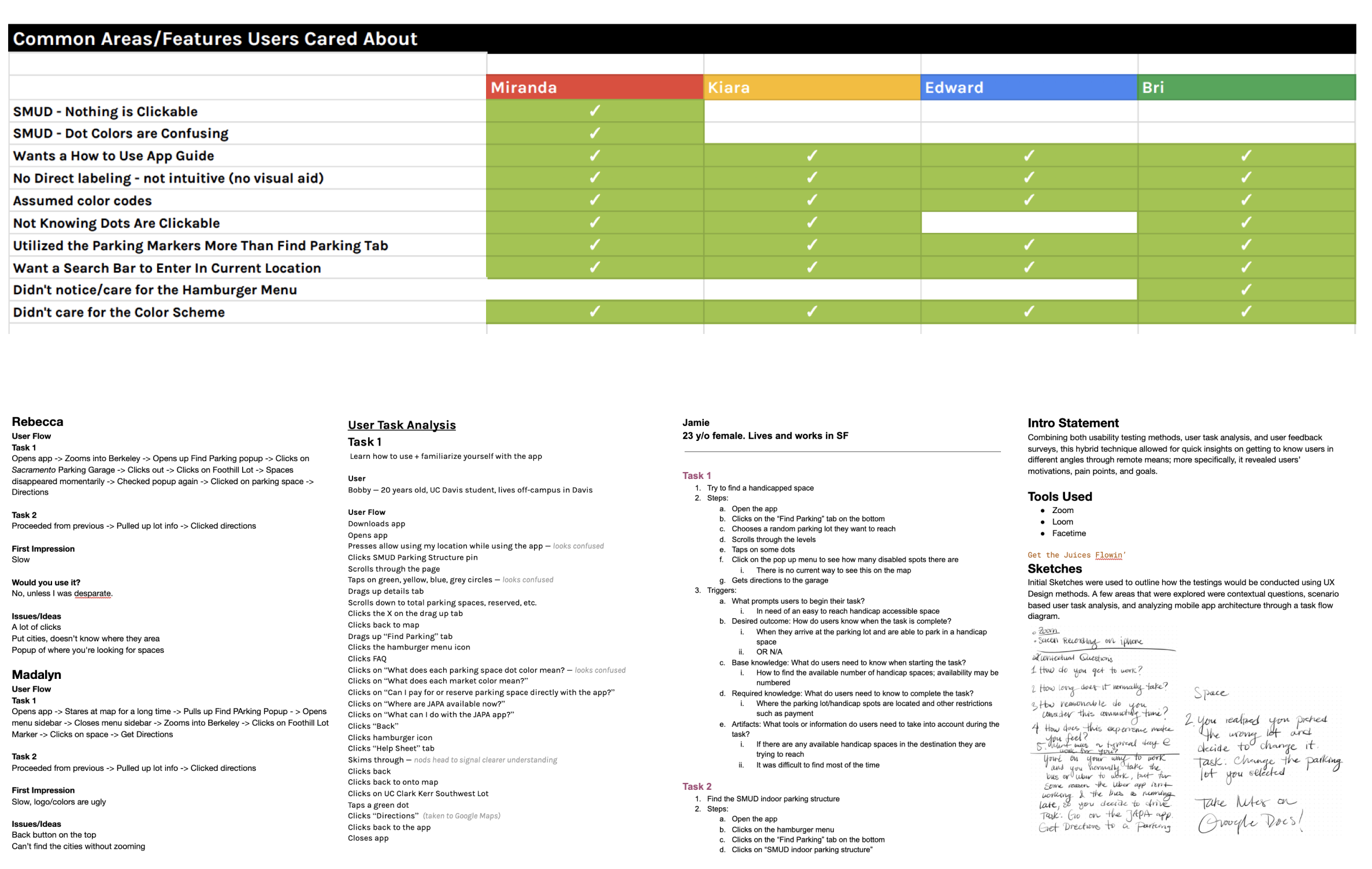
In the user task analysis, we had different users use the current JAPA app to complete a series of tasks, including locating lot information and finding an available parking space. We were then able to observe the pain points in the current app and the thought process users would have when approaching the task in the app.
We began to understand what thought processes and other factors drive user decision making. By using a user insight matrix, we found that users wanted a guide to help them understand the app and a search bar to easily find parking lots within their area.
Competitive Analysis
We researched a variety of direct and indirect competitors. We gained valuable insights to understand different user flows and common themes within mobile architecture to see where JAPA stands within their competitor pool. Through this analysis, we identified opportunities for success in the new Japa redesign.

Personas
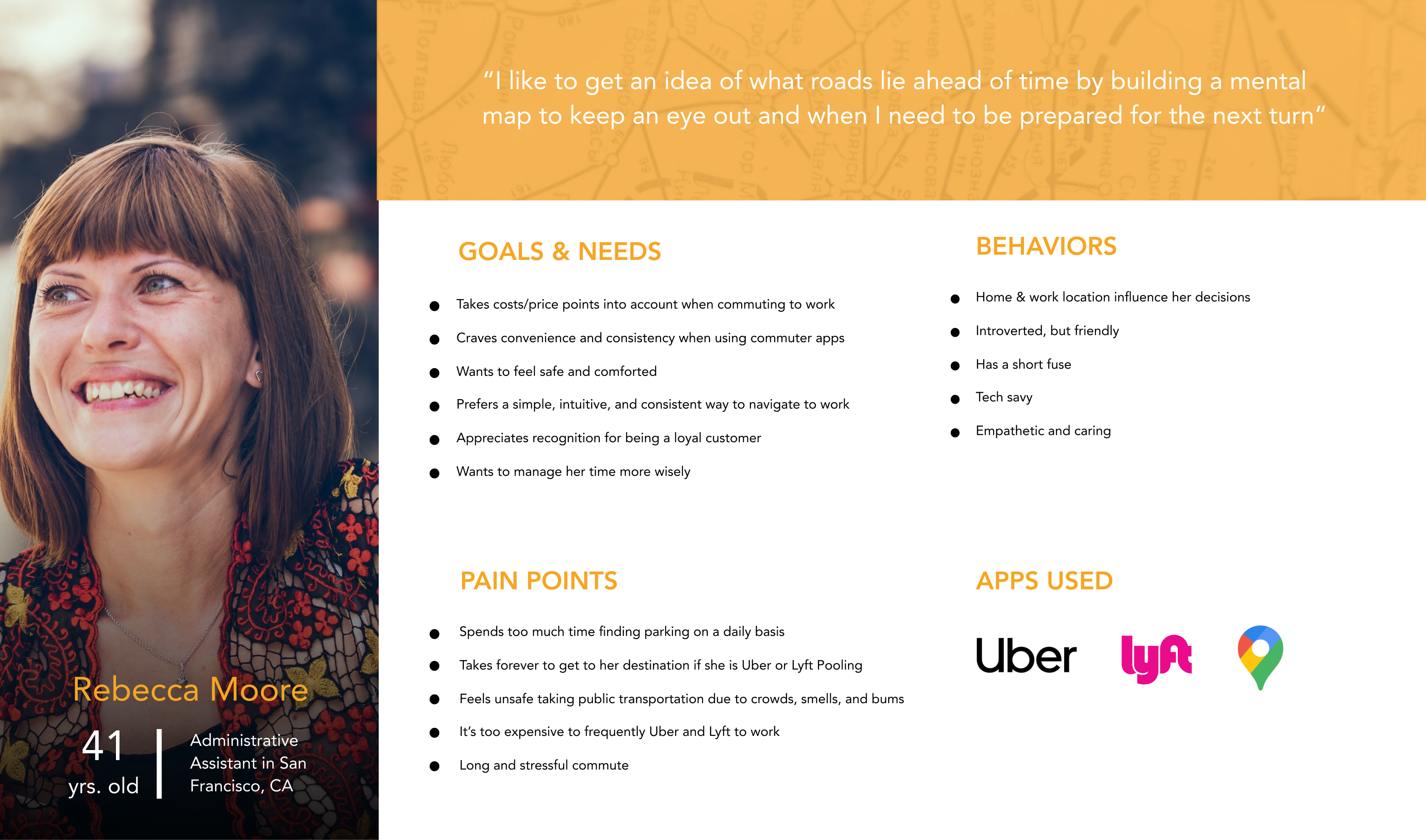
After gaining insight on what to design, we developed two personas in order to build empathy for our end-user. These were developed from compiling data from each team member interviewing two individuals from user task analysis.
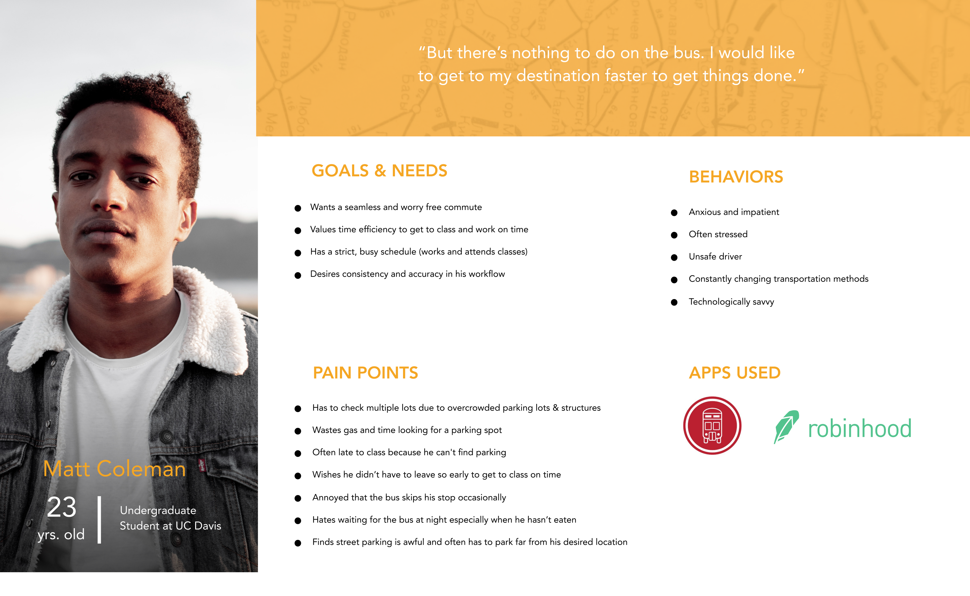
“But there’s nothing to do on the bus. I would like to get to my destination faster to get things done.”
IDEATION
Discovering the New Japa
After synthesizing our research, we needed to break down what the problems were and how we could solve them. Our team employed a handful of strategies to synthesize the research and come up with solutions.
The Golden Path
One of our top priorities in the redesign of the app was maximizing efficiency, which made it vital to minimize the number of screens a user needed to go through to complete their task. The Golden Path, also known as the Key User Journey, is a set of steps that would lead the user to find their ideal outcome. We used this to identify the essential screens within the app and how we could optimize the flow from one screen to the next.

Affinity Mapping
After synthesizing all of our research, we wrote out different “How Might We?” questions to identify issues in the app. We then organized these into categories to find the broader problem spaces to focus on, such as navigation or the parking layout feature. Not only did this help us identify the necessary features for the app, but also some questions served as goals for the whole project: maximizing visual appeal, making the app recognizable to users, and the focus on efficiency.
With the list of design issues in hand, we prioritized them based on the insights gained from our user research. We brainstormed answers for these questions, some drawn from our competitive analysis, and discussed and voted to select the ideas that could most effectively solve user problems.

WIREFRAME
Putting it All Together
With our ideation phase, we were able to narrow down our scope to a few key features.
Sketches + Wireframing
We started by sketching each feature and making sure we are on the same page when it comes to the user flow. With these sketches and wireframes, we discussed refinements and developed guidelines for visual design such as icons and component placement.
Our weekly team meetings with the client helped us to pinpoint areas that need attention and further development. As a team, we analyzed ideas that would further the user experience and with that feedback, would iterate our respective categories until we received positive feedback from both the user and client.


Sketches by Miranda and Briana, wireframes by Kiara and Edward
USABILITY TESTING
"Find a mapped route to the parking lot"
With our mid-fidelity prototype completed, we decided to run some usability tests in order to ensure our app was following our original goal of being efficient and intuitive. In the same fashion as affinity mapping, we narrowed down options of what to test. After listing our features and correlating tasks, we developed questions that would allow us to get direct input from our users.
Map Screen
We created a quick look/list view feature in order for the user to easily identify the main information of a parking garage such as cost, location, and distance. The problem was how the quick look feature (with map) transitioned to the list view (without map). Through usability testing, we noticed that it wasn't intuitive for the user to tap on the quick look information box to get to the list view — a problem of visibility. With the information gathered, we developed a way for the user to simply scroll down to see the list view utilizing intuitive indicators.

Parking Layout
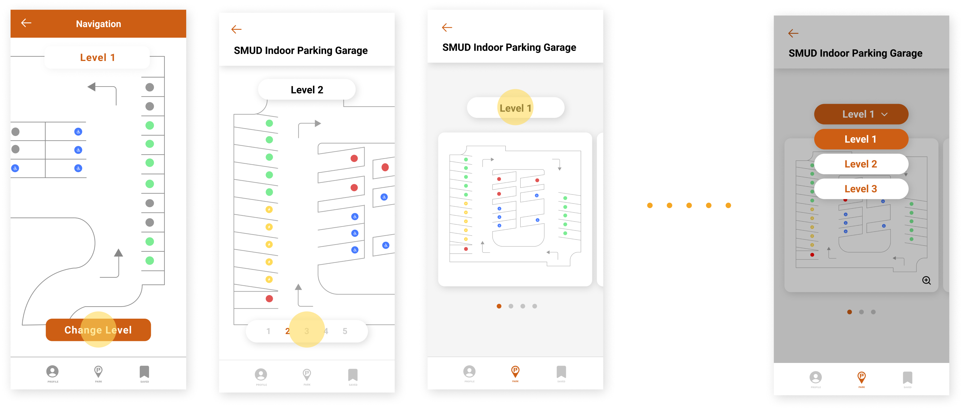
Users expressed that the "Level 1" title was a button and tried to click it because we consistently used this pill shape throughout the rest of the app. We also noticed that most users didn't try to click on the parking layout cards because there was nothing to indicate that it was clickable.
To improve upon these areas, we turned the "Level 1" title into a button that allowed users to hop in between levels more quickly and added a magnifying glass icon in the bottom right corner of each card to indicate that they could zoom in to see the level more closely.
A/B Testing
To find out what was more easily understood by our users, we conducted A/B testing. In our initial designs, we had used a muted red color to indicate an unavailable parking spot and an "R" symbol to indicate a parking spot with special restrictions. Although the red hue still communicated unavailability to our users, it wasn't as noticeable. As for the restricted spots, we found that users thought the "R" meant reserved.
We changed the red parking spot icon color to a more vibrant and bold red, which more quickly identified as an occupied space. To help our users understand its actual meaning, we replaced the "R" with a star icon and added an explanation of what the star meant to clarify its meaning even further.


HIGH-FIDELITY PROTOTYPE
Our Final Product!
Sign in / Sign up
After opening the app, new users are prompted to create an account by entering their phone number, name, vehicle information, and preferred payment method. This serves to make all future parking experiences simpler, such as paying for parking and identifying where they last parked.


Onboarding
To highlight features of the app and convey the goals of JAPA, a brief set of onboarding screens appears after the first sign in. Users can swipe through the information, or skip it should they prefer to explore the app on their own.
Search and Filter
Users can identify parking locations in the area, filter options to their situation. This new workflow and structure allow for easy scalability and gives more control to users.


Quick Look
Users can quickly access information such as an address, cost of parking, and distance.
Parking Layout
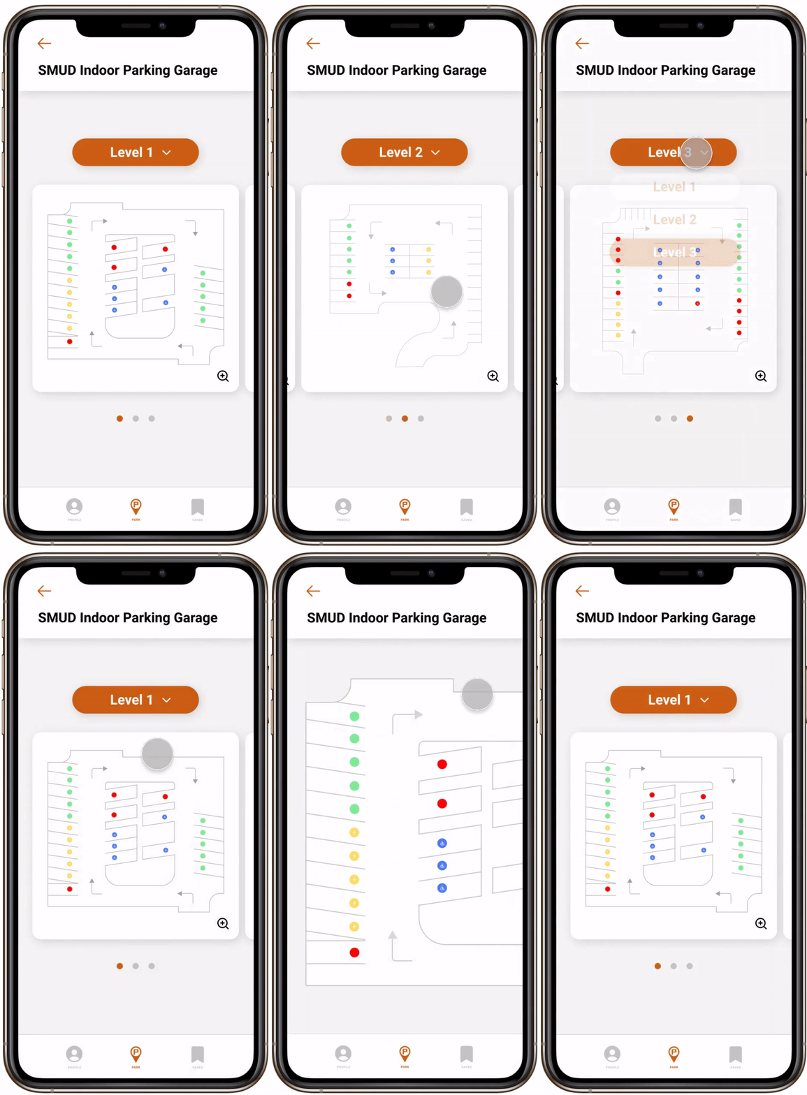
Users have the ability to check parking spot availability on multiple garage levels. They can easily decide which level to park on based on the color-coded parking spots.
Lot Information & Navigation
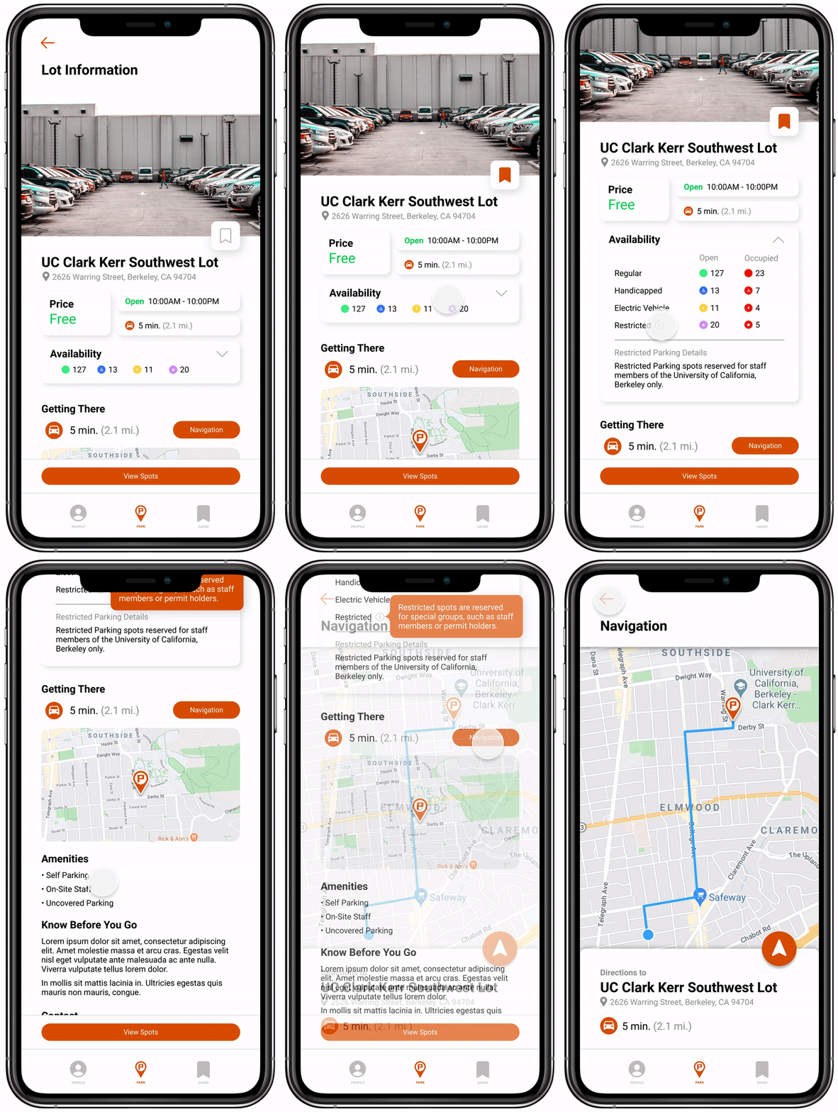
Next is the lot information page, which comes up after a user clicks into a particular lot. Here they can add the lot to their saved lots, see all the details about a parking lot—including the availability of different types of parking spaces—and they can get navigation to the lot without ever leaving the app.
Saved Lots
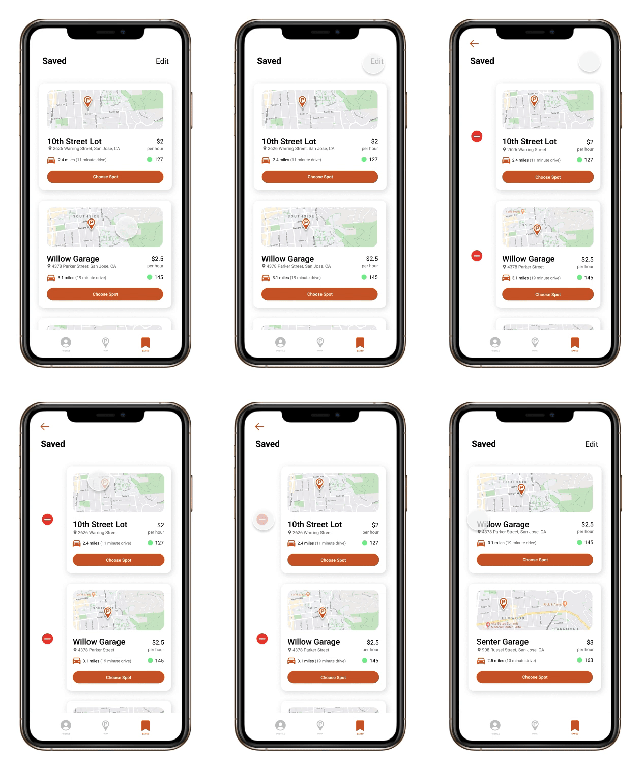
Users can save their frequented lots/garages to check parking availability quickly without having to search for the location. They can also delete any locations they no longer visit.

Profile
Users can seamlessly update their personal information through the profile tab.
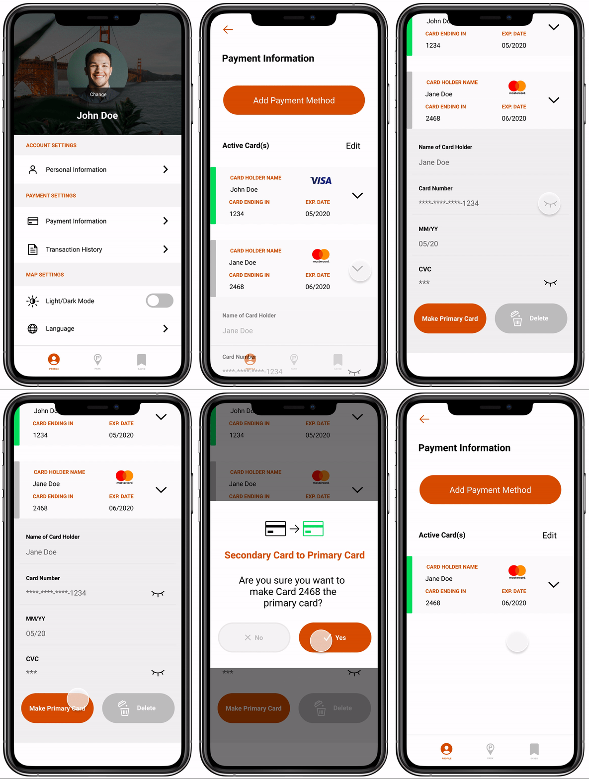
Payment Information
Users can access their payment information through the profile. This allows for future integration of in-app parking payment and efficiently organizes their transaction history.
