Role
This project was a part of the Adobe x Airbnb Creative Jam Competition. I collaborated with one other designer on all parts of the design process. My role emphasized initial wireframing and visual design while Vivian emphasized user research and prototyping.
Overview
Airbnb has been a changemaker in connecting a community of travelers. With their large audience, there is a potential for further interactions and exchanges beyond the trip itself--beyond the reviews, and beyond the ratings. They can facilitate the growth of these connections from within their community.
This is the mentality behind our implementation of Airbnb Journal.
Airbnb Journal furthers the experience by connecting travelers to each other through stories, experiences, and accounts. With a common goal of their love for travel, users can track their travel status and see how much they’ve experienced worldwide. With simple and intuitive design patterns, everyone on the trip will have the ability collectively share, post, and collaborate on a digital journal of their trip.
About
User research, Interaction, Visual design, Prototyping & testing
Team: Vivian P.
Tools: Adobe XD, Figma
Time: 3 days
The Problem
Our goal was to empower families and groups of friends who travel together a collaborative way to document, organize, and share their travel experiences and stays to the larger Airbnb community.
Currently, Airbnb only allows guests to interact with hosts — there’s no platform for guests to speak with one another on first-hand experiences. With a large number of users and no user-to-user interaction, Airbnb is missing the potential to build on that space. Guests have valuable insight from location, to food spots, to safety. Sharing that information could benefit both the host and potential visitors by assisting other travelers to make their decision, and also double as a way to document unforgettable trips.
USER RESEARCH
Travel Like a Human
With our 3 day deadline, we needed to condense our research without compromising the results and our ability to understand the end-user.
How Might We?
How might we allow for collaboration on trips: The main goal of this competition was to create an experience to bring Airbnb travelers together so collaboration on trip itineraries or recording experiences would increase user-to-user interaction.
How might we construct an enjoyable, gamified experience: In addition to collaboration, we believed it was important to develop an experience for the user to keep coming back for more. With social media sites such as Instagram and Snapchat allowing them a platform to post their experiences, we wanted to establish incentives for future use specific to Airbnb and the traveling experience.
How might we build a safe space for the larger Airbnb community to interact with one another: Airbnb's guests are explorers, foodies, adventurers — through understanding the community, we wanted to develop an open space for them to share interesting experiences, secret food spots, and hidden gems in the area. Overall, we wanted to create a safe and respectful platform to share stories and insights.

Getting to Know Our Users
An important aspect of this application was how community members will interact and share experiences — we wanted to understand our users in full to create a user-friendly, intuitive experience for them. Our team researched and interviewed individuals from various user groups to understand our target audience.
Interviews gave us a good sense of Airbnb's clientele and helped us to empathize with current pain points but with our narrow timeframe and limited number of interviewees, it was also crucial for us to understand the quantitative data of Airbnb and its guests. Through these data points, we realized the importance of integrating social media-like ideas into the interface and were also able to narrow down our scope:

How might we build a safe space for the larger Airbnb community to interact with one another?

IDEATION
The Discovery
After understanding our users and pinpointing the main components of our extension, we analyzed competitors and the successful elements their interface employs. Our key insights from this exercise led us to develop these features
Giving group members a way to create a single trip or multiple stories, during or after travel
• Travel journal-style with a collaborative album/trip
Letting all family or travel members contribute, no matter how old they are
• Accessible to all ages — easy to read, understand, operate, intuitive

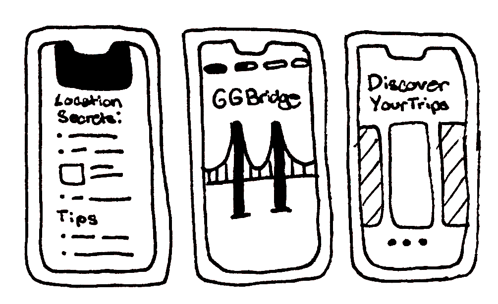
Permitting the sharing and organizing of photos, videos, notes, recommendations, links, and more
• “Journal entry”
• Sections include photos and videos
• Notes and tips — location secrets
• Recommendations — restaurants etc.
• Live mode/ story mode
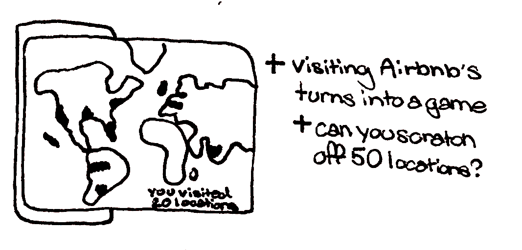
Encouraging engagement with a gamified experience
• Something interactive? Like a digital scratch-off map
• Something fun and makes it unique and “gamified”
• Interactive map on places you’ve traveled etc
• Progress status — the game is to travel the world
• Live story mode on a map

Allowing people to learn, favorite and save stories, discuss, and safely connect
• Open access to everyone with public posts
• Be able to bookmark journals/stories
• Comment section
• Only verified users can post about their experience
Information Architecture
With these features developed, we started to think about how to put these puzzle pieces together in a way that is clear and creates a seamless experience.

WIREFRAMING
Putting it All Together
Low Fidelity Prototype
After pinpointing the main components of our extension, we developed these low fidelity prototypes in order to visualize where each would be placed and how the screens would work with one another. This meant reworking our initial ideas and cutting out aspects to streamline the user experience. My work (top), Vivian's (bottom).


CLIENT ANALYSIS
Understanding Airbnb
Since this was going to be designed as an extension for the Airbnb app, we needed to make sure we understand Airbnb's design system and the ideas behind it. This would allow us to both connect with the company and get clear visual direction on how to proceed with our high fidelity prototype.

Unified Universal Iconic Conversational


HIGH-FIDELITY PROTOTYPE
Our final submission!
Home Screen
Access recommended stories on the home screen and filter options with the search bar.


Saved Stories
Save any story you find interesting or one you may want to use a travel guide for your next Airbnb getaway.
Interactive Map
Fill your world map with pins and try to visit as many Airbnb locations as possible to unlock new features.

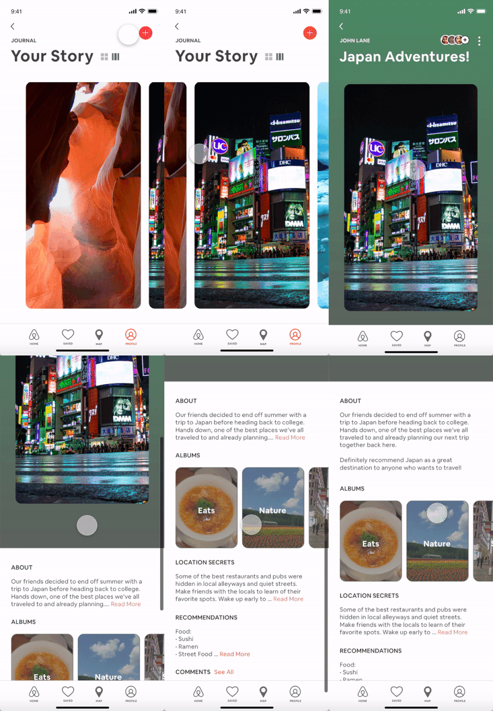
Story Information
Reminisce on your past travels while filling up your journal with stau secrets and tips for future visitors.
Story
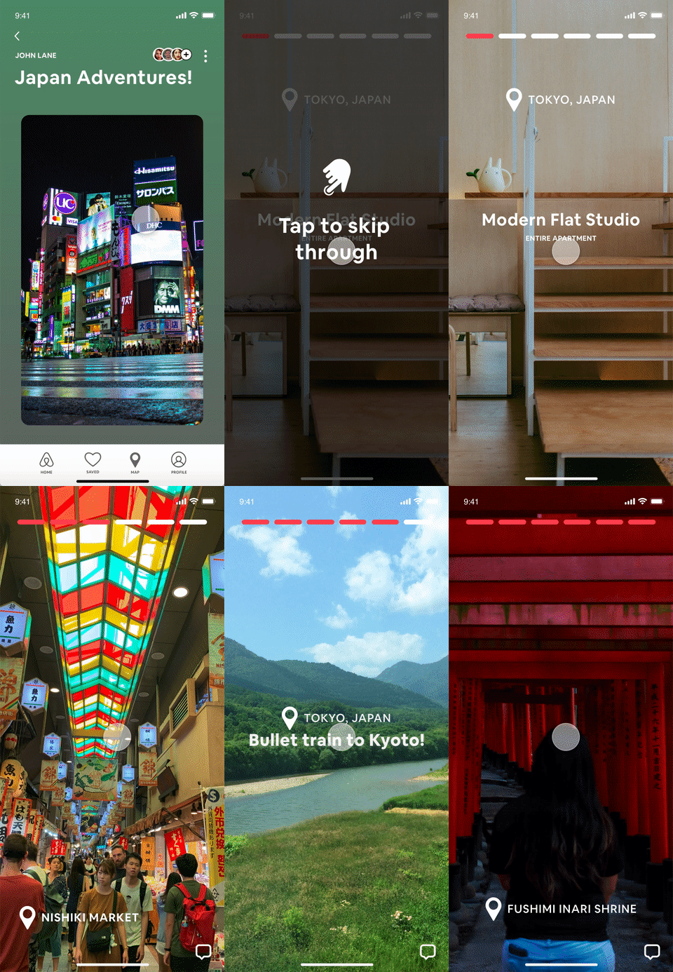
Click through the story feature to see live photos and nearby Airbnb locations for your next trip.

Add Story
Easily add new stories and include friends and family to collaborate on your interactive journal.
