Role
Lead UX Designer. Worked with 4 strategists to develop the concept and marketing. Led user research, ideation, and prototype.
Overview
The University of California, Davis currently utilizes a physical student ID card for various amenities such as dorm, bus, and food access.
The goal of this project was to create a digital student ID app that results in greater accessibility and convenience for those on campus.
About
User research, Interaction, Visual design, Wireframing & testing
Team: 2 designers, 4 strategists
Tools: Sketch, Illustrator
April 2019 - May 2019
The Problem
The University of California, Davis currently uses a plastic student identification card. It provides access to the various products, services, resources, and benefits that the university offers such as entry to dorm rooms, food payment, and bus transportation. The problem lies with the fact that it is a simple piece of plastic; easily forgotten and misplaced. In addition, much potential is lost with students not being able to perform simple tasks such as checking the balance on their card.
By going digital, students will no longer have to worry about misplacing their ID as they will always have access to it on their phones. It will open up a wide variety of opportunities and create a more efficient and convenient experience.
USER RESEARCH
Understanding the Student Experience
To jumpstart the research and get a better understanding of the importance of this digital switch, we interviewed several students, created user personas, and conducted a competitor analysis. This allowed us to identify the pain points students encounter on a daily basis.
Getting to know our users
In order to build empathy with the user, we developed two user personas to design for. These were developed through each team member interviewing two students from various user groups and working together to synthesize our gatherings.


Key insights
Students do not know the potential of their student ID
University "cash" is difficult to reload, can be optimized
Need a second option for an emergency situation
Transportation information is inconvenient to access
IDEATION
Let's Map This Out
Information Architecture
With the information we gathered through testing, our team decided to add a digital student ID card that allows 1st-year students to access their dorm rooms and dining commons through their phone, quickly view bus information, and efficiently add money to their account.
To understand how the user will navigate these features, we created a user flow diagram. This helped us visualize how the users will interact with the information being presented, and also account for error states.

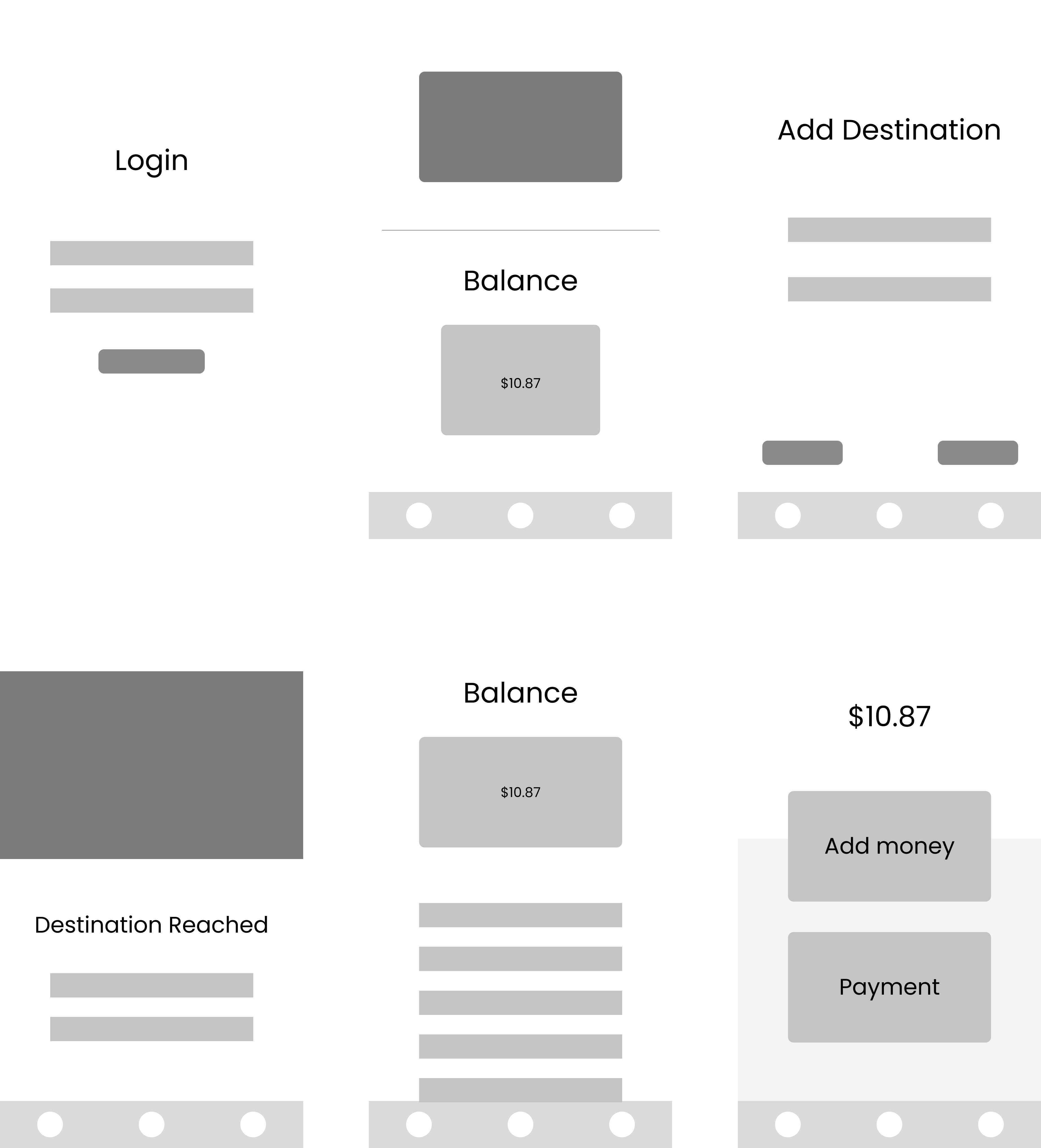
WIREFRAMING
Getting Down to Business
Low Fidelity Prototype
With the path completed, we developed some low fidelity prototypes to help visualize the look and feel of the application before adding branded elements. While building these screens, we checked in with 2 users to get their insights on the content. The main insight we received is that by adding in the calendar, it takes away from the app being based around the capabilities of the student ID card. With that information, we were able to refine the concept further and continue to the next phase.
Unsuccessful Iteration
Our team wanted to incorporate the University of California's main colors of blue and yellow into the interface and landed on this look and feel. We conducted some user testing and our main insights landed around users feeling too overwhelmed with the bright colors. Many of them didn't feel that it looked professional or legitimate so we regrouped.
"I think it's a bit overwhelming to look at especially since I would just be opening it quickly to get into my room."


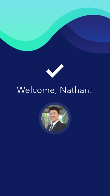
HIGH-FIDELITY PROTOTYPE
Our Final Product
After continuous refinement and user testing, we were able to establish a user-friendly interface that accomplished the original goal of creating a more convenient student experience on campus.
Continuing this project, I would like to implement different visual styles, test additional user flows, and expand to modern UI trends.